iPhone 14’s Top-Notch Dynamic Island

Dynamic Island displaying app specific notification. Apple.com
The iPhone 14 Pro was revealed on September 7th, announcing some expected improvements to current features, and a whole slew of newly added features like eSim, SoS satellite communication, and more that you can learn about on apple.com if you haven’t yet.
One new feature in specific has caught my attention for its wit. The Dynamic Island, formerly known as the “camera notch”.
The Notch
First introduced in 2017, the notch served as a window for the front facing camera and sensors to look through, without obstruction. LG was the first phone to incorporate the “notch” back in 2017 with its Essential Phone PH-1, six months before the iPhone X embraced the design and went all out with the big notch in September of that year.
Many people saw it as a nuisance. Samsung made fun of it. We got used to it, and pretty soon we forgot it was even there.
For those who have better things to do than learn about something called “negative space”, what it means is: the space or visual shape created by the presence of other primary visual elements. For example: the two circular holes in the number “8”. Or the heart shaped cove in the number 3.
In the case of the new iPhone, it is the black, pill shape that becomes visible only when the area around it is lit. Just like the two circles of the number 8 become visible only after the strokes are drawn. So what do we do with these unintentional shapes?

FedEx logo with the negative arrow.

USA Network logo with the negative “s”.
Well, graphic designers, especially logo designers have been playing with this idea for decades. We see them everywhere these days. A few of the greatest examples are the hidden arrow in the FedEx logo, NBC’s colorful peacock logo, and USA network’s invisible “s” logo.
But I had yet to see such clever use of the negative space in tech, let alone a dynamic use. Until now.
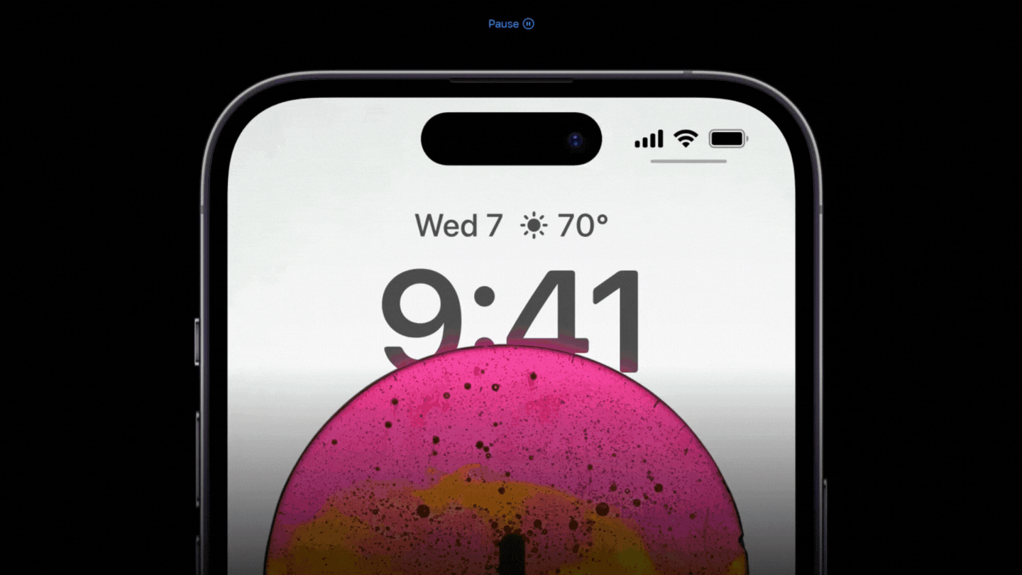
Dynamic Island
On June 6th, Apple changed the game. With the announcement of the new iPhone 14, came the all new design of the notch. However, this time, everything is different. If you are a reductionist, you will probably call it “just a notification bar”. If you do, you either need a hug, or you’re just not a UX nerd. But if you are one like me, you’ll recognize that the Dynamic Island is a very creative software solution (UX) to a hardware limitation (camera notch).
But it doesn’t stop there. It goes even beyond that. It embraces this limitation as an opportunity to reimagine user interaction with the device. But as Apple does Apple things, they had to make it seamless.
Dynamic Island displaying motion design examples of flexing, elasticity, overshoot, and morphing. Apple.com
Enter Motion Design
Motion design plays a huge role in UX. See, when movement is added to a graphic element on a screen, it needs to be lifelike. Motion design is animation for graphic design. In the case of smartphones, animating the screen we interact with, and all the nuances of its interface. One of the most common examples is the swipe gesture.
Here is a scenario to paint a clear picture of what interfaces would feel like if motion design and animated interfaces didn’t exist:
Next time you’re on your phone or tablet home screen. Take a glance at the app icons. Prepare to tap one of them, but, imagine when you tap the icon, instead of the icon enlarging to gradually fill your screen, the first page of the app just POP! appears out of nowhere! How unsettling would that be?
These are the little micro-interactions we take for granted. Apple doesn’t. The point is, if movements don’t look easy on the eye (pun intended for my motion design crowd), you WILL notice.
The elastic behavior, flexing, overshoots, and the liquid morphing of graphic elements, all work in harmony to bring us a seamless and lifelike experience. Completely repurposing what once was a nuisance called the camera notch. So when I see such care and attention to detail poured into “just a notification bar”, first I appreciate it, then you bet I’m going to write about it.
When Life Gives You Lemons…
Ultimately, the reimagined notch is a true example of thinking outside the notch, sorry I mean the box! It’s as if the Apple UX department were directed to wear their brains inside out to come up with it. It is truly the most clever use of negative space in UX. It teaches us one very important lesson: when tech gives you camera notch, you make Dynamic Island… Cheers!🍹